Before a single wall was drawn on the seventh floor at The Shard, the floor was studied as an empty volume and the sun was traced across it. Everything that happened afterwards followed from what that study said.
Why a tower needs the study more, not less
The Shard is daylit on every side, which sounds like a reason to skip the exercise. It is the opposite. A building glazed all round has a different quality of light on every elevation at every hour, and a floor plate this high has close neighbours casting shadows that arrive at particular times and then leave. Level 7 also has an irregular perimeter, structural columns in awkward places and a party wall shared with the tenant next door.
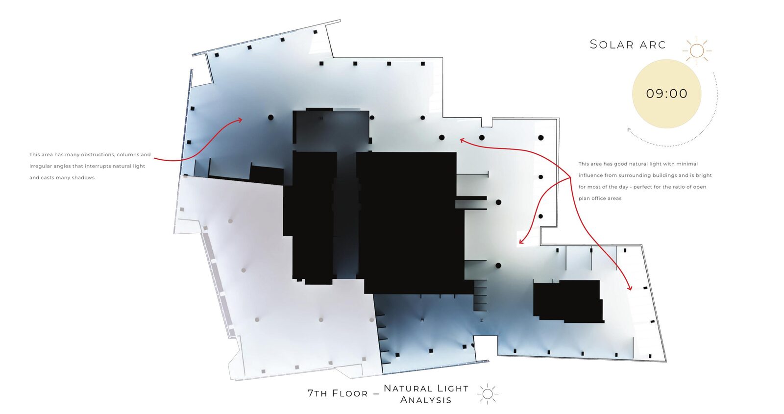
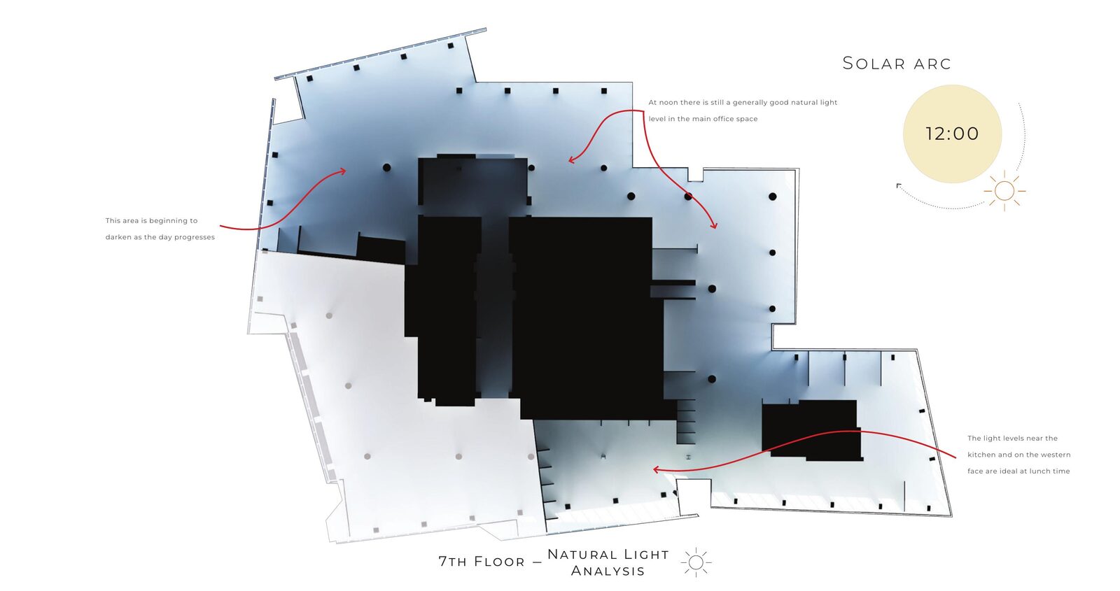
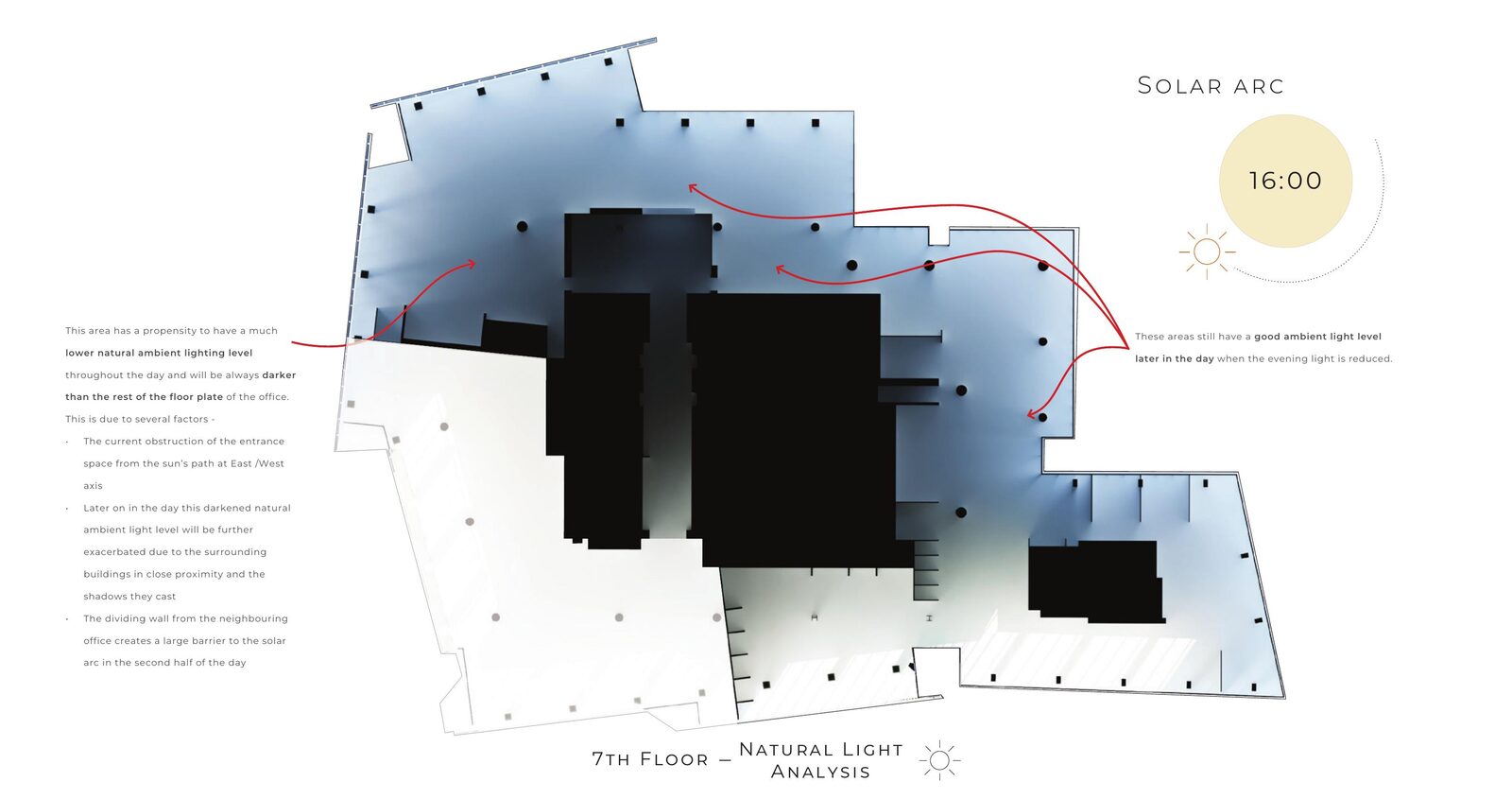
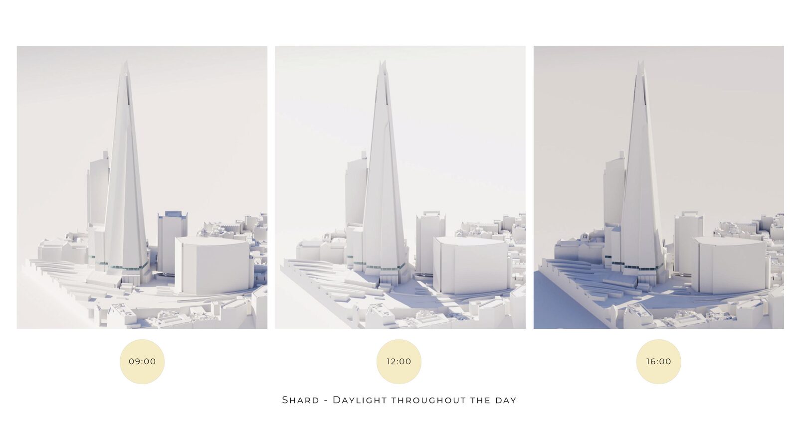
So the tower and its surroundings were modelled as plain white massing and the floor plate was rendered at three hours: nine in the morning, noon and four in the afternoon. Three drawings, one floor, no furniture.
What the drawings said
The north-eastern stretch of the plate came out bright, with minimal influence from the buildings around it, and it stayed bright for most of the day. West of the core the picture was the opposite: obstructions, columns and irregular angles interrupting the light and casting shadows across it. By noon the main office still held a good level throughout, and the kitchen side and the western face were at their best.
The four o'clock drawing produced the most useful finding of the three. One area is darker than the rest of the floor all day and gets worse as the day goes on, for three reasons that compound: the entrance is obstructed from the sun's path on the east to west axis, the neighbouring towers throw shadow across it later on, and the dividing wall to the office next door blocks the solar arc for the whole second half of the day. No amount of glazing was going to fix that zone. The honest answer was to stop trying.
From a drawing to a plan
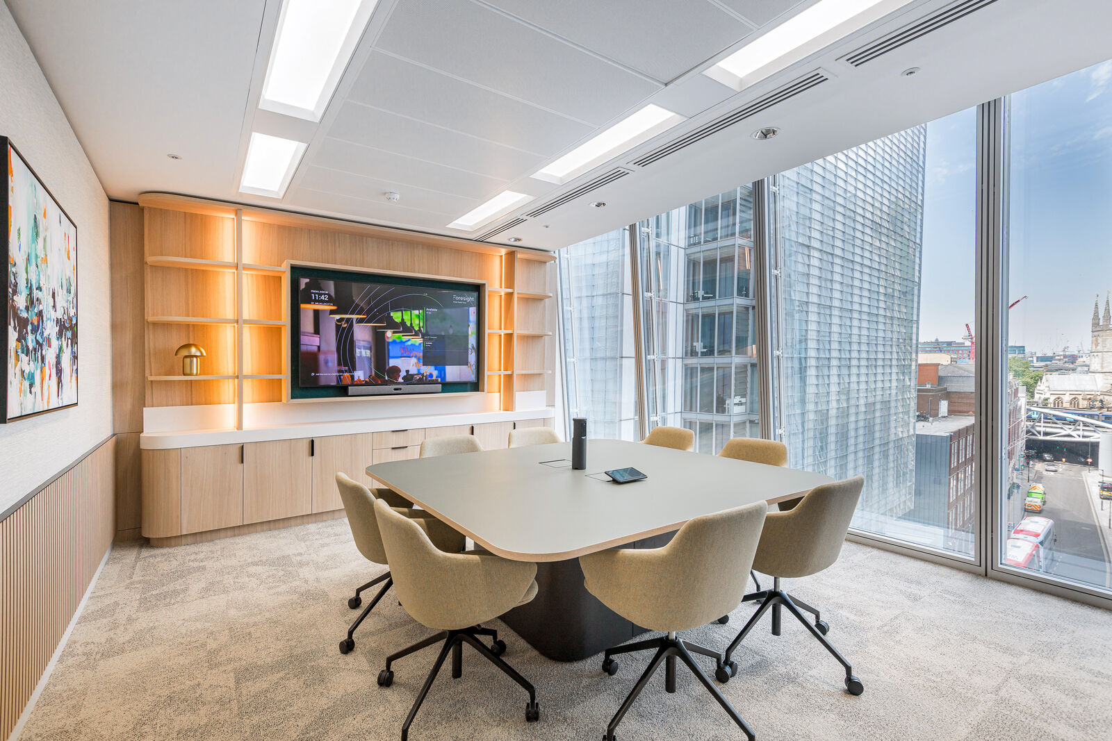
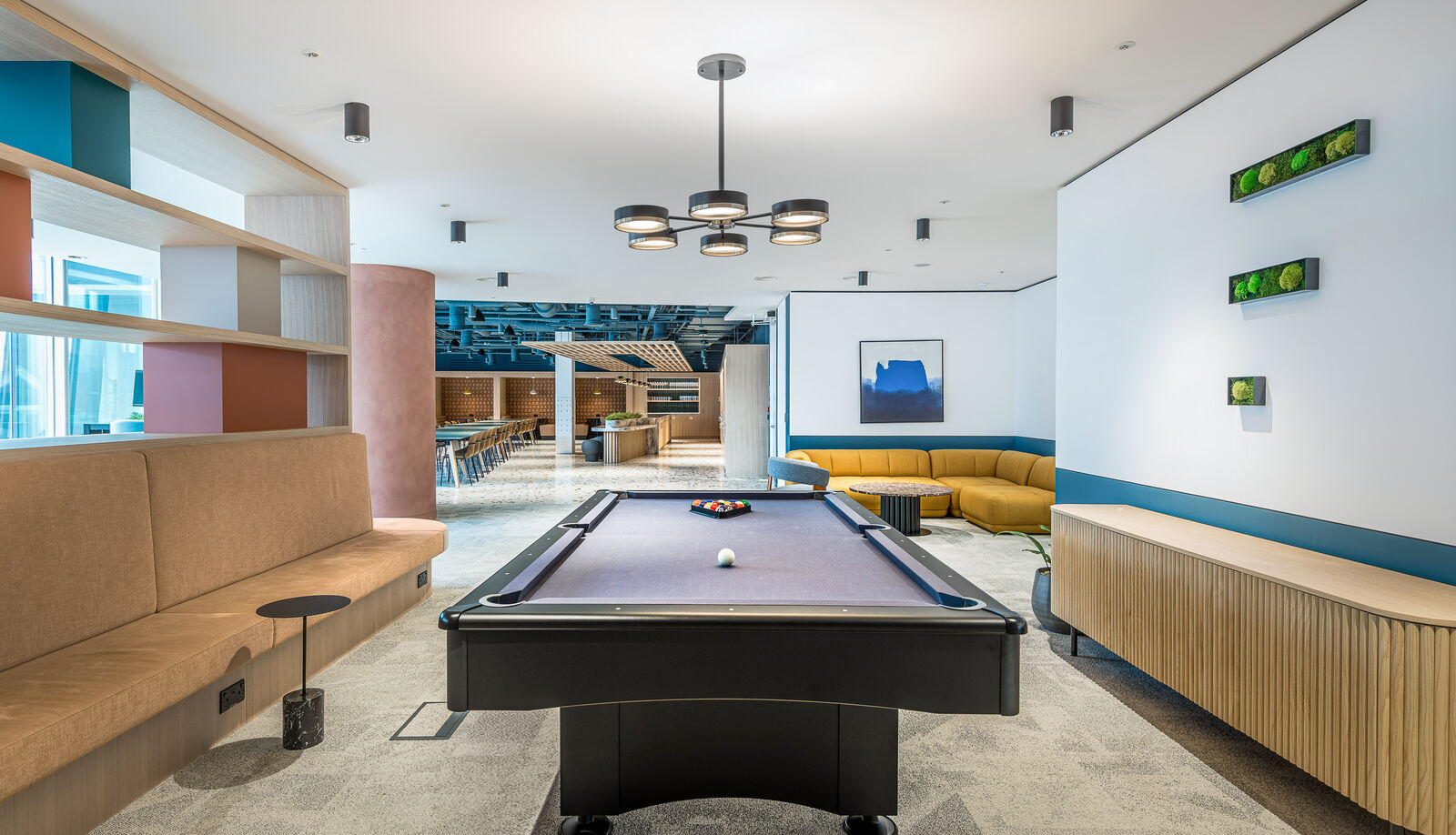
Desks went where the light was, in the ratio the bright zone could carry. The meeting hub went into the dark zone, and the reasoning is worth spelling out because it is a wellbeing argument rather than an aesthetic one. A meeting room is used intermittently, by different people, for forty minutes at a time. A desk is occupied by one person for eight hours. Given a corner of a floor that will never have good daylight, it is fairer to put the rooms there than to sit somebody in it every day.
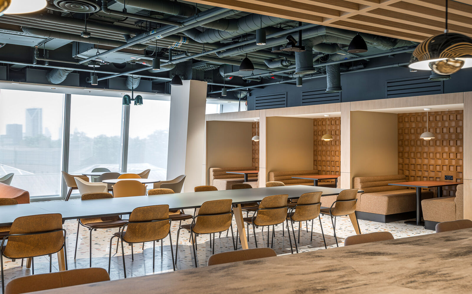
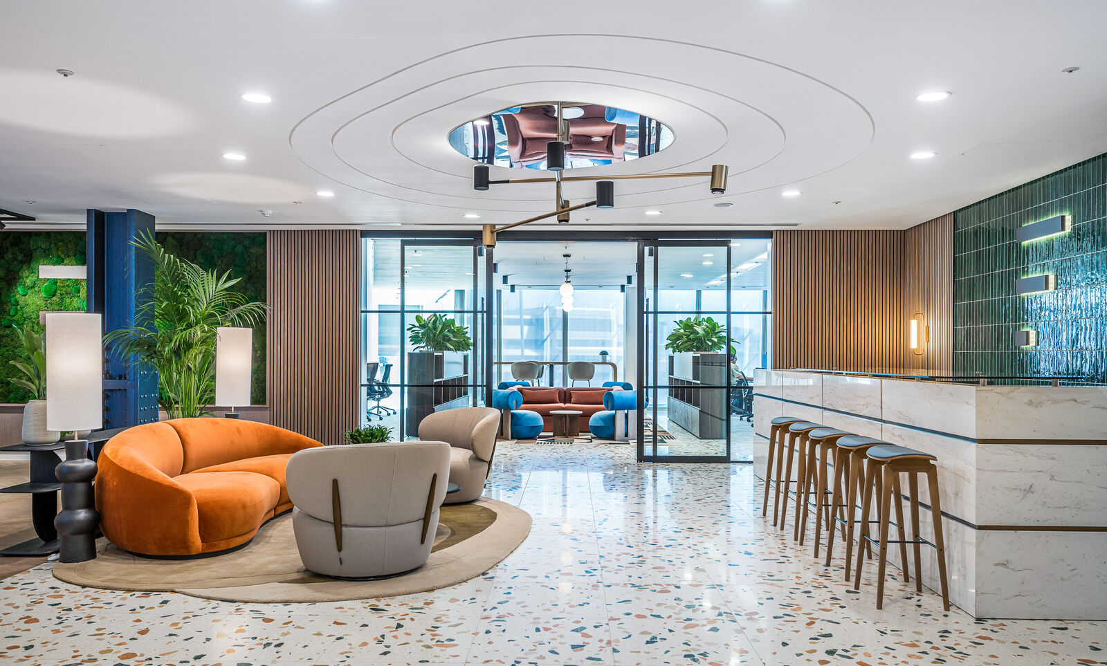
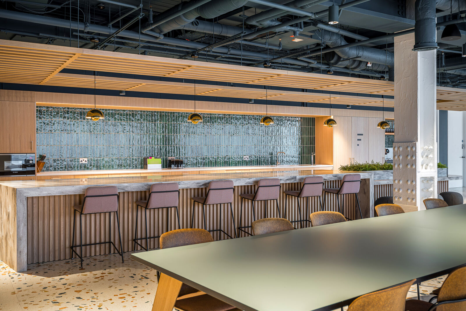
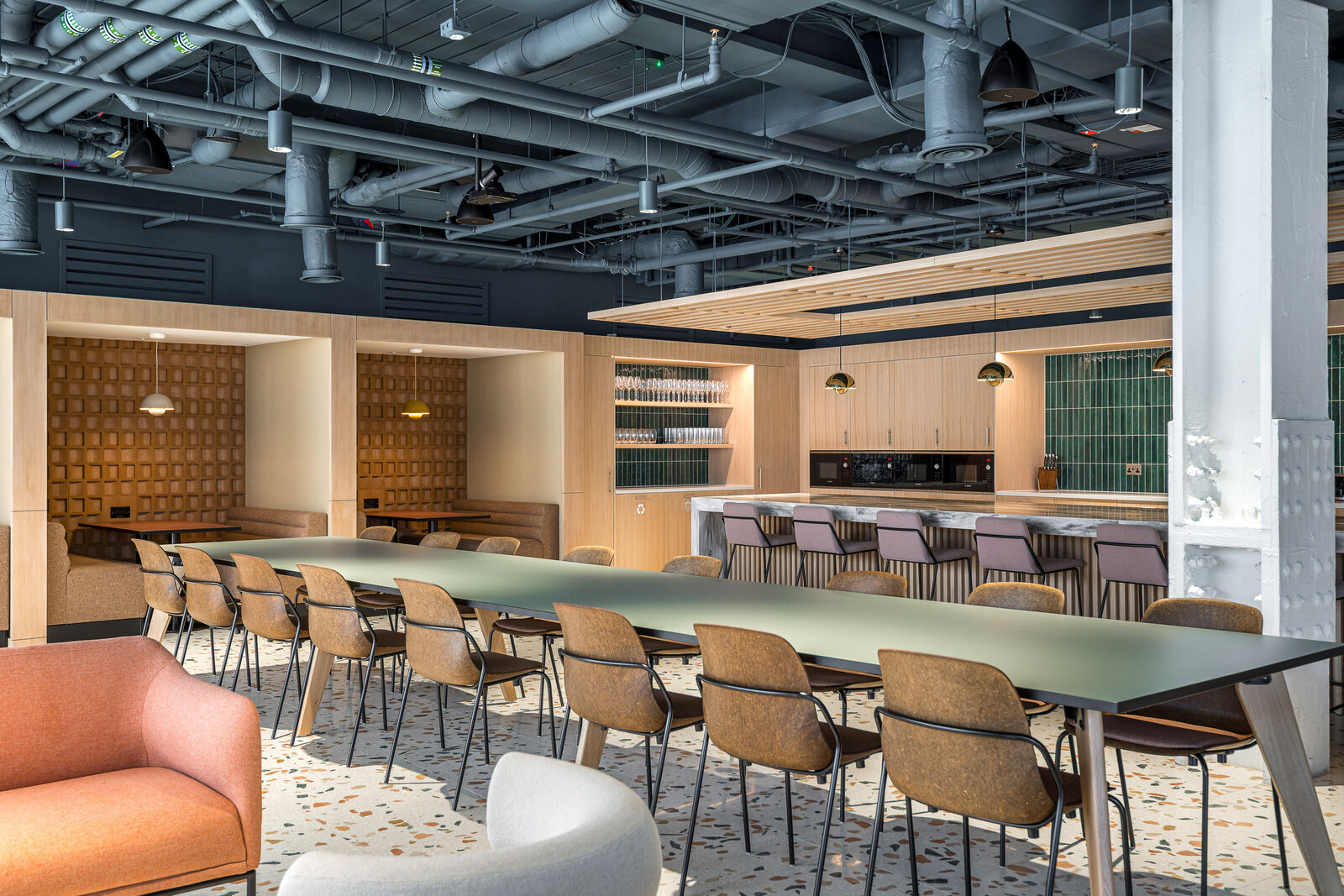
The kitchen and dining took the western face, which is at its best over lunch, the hour that side of the floor is busiest. The entrance, in the zone the sun barely reaches, was lit and finished as though daylight was never coming: a dark ceiling, a media wall, an illuminated mark in the floor tile, warmth from the materials rather than from the windows.
The other half of the brief
Light is not only something to chase. The brief asked for glare on screens to be considered and for desks to be positioned for daylight, which are two requirements pulling against each other. The same study answers both, because a drawing that shows you where the light lands also shows you where it lands too hard.